
Typography Psychology: Why Font Choice Isn't Decoration
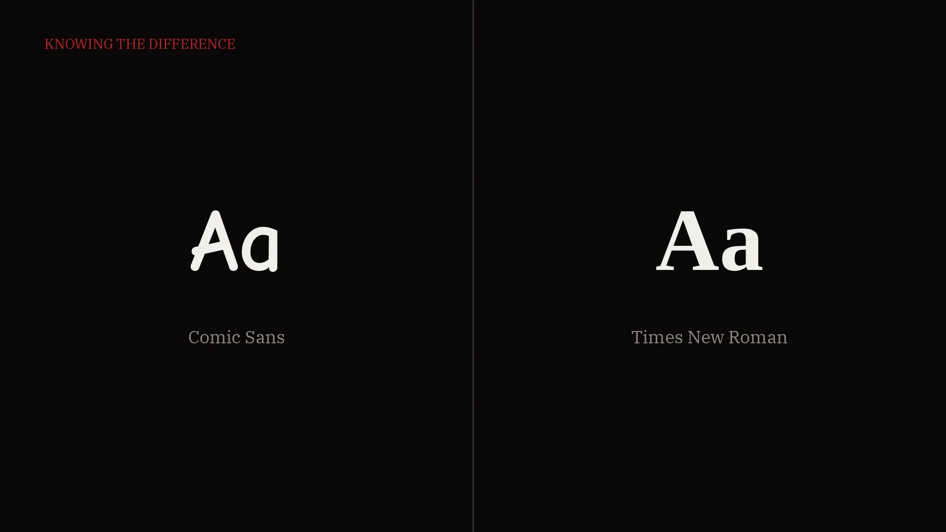
You don't actually understand typography just because you know the difference between Comic Sans and Times New Roman. That's the beginner level. Real typographic understanding starts when you can tell the difference between Times New Roman and IBM Plex Serif, two fonts that look similar at a glance but say completely different things about a brand.
Let's get the technicalities out of the way quickly. Times New Roman is a traditional serif. IBM Plex Serif is a slab serif. That single classification difference changes everything about how each one is read, felt, and trusted.
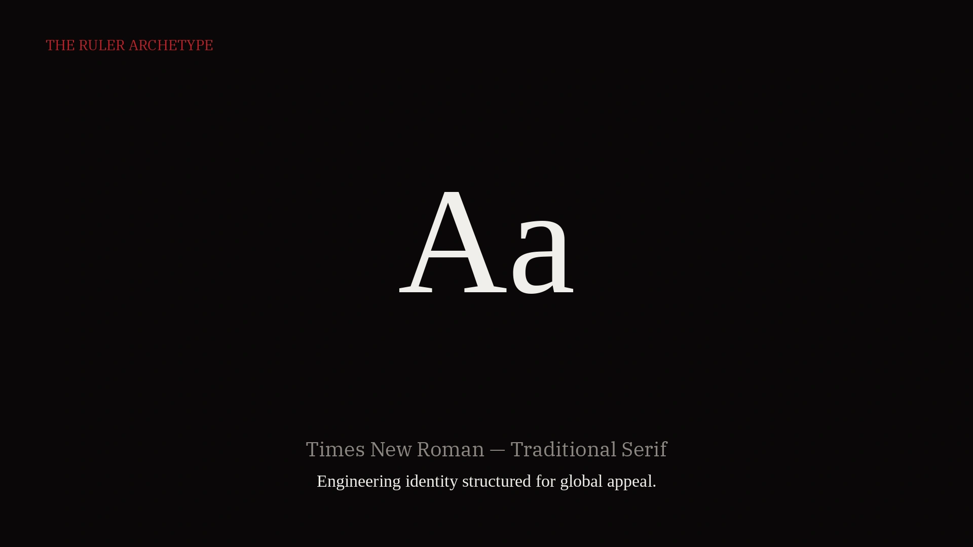
Times New Roman carries an authoritative, commanding voice. It fits brands that sit in what's called the "ruler" archetype, brands that essentially decide for their audience what's right and what's wrong. They function like an institution. If you study how its curves and widths shift, you'll notice it mimics a certain kind of authoritative voice modulation, formal, rigid, official.
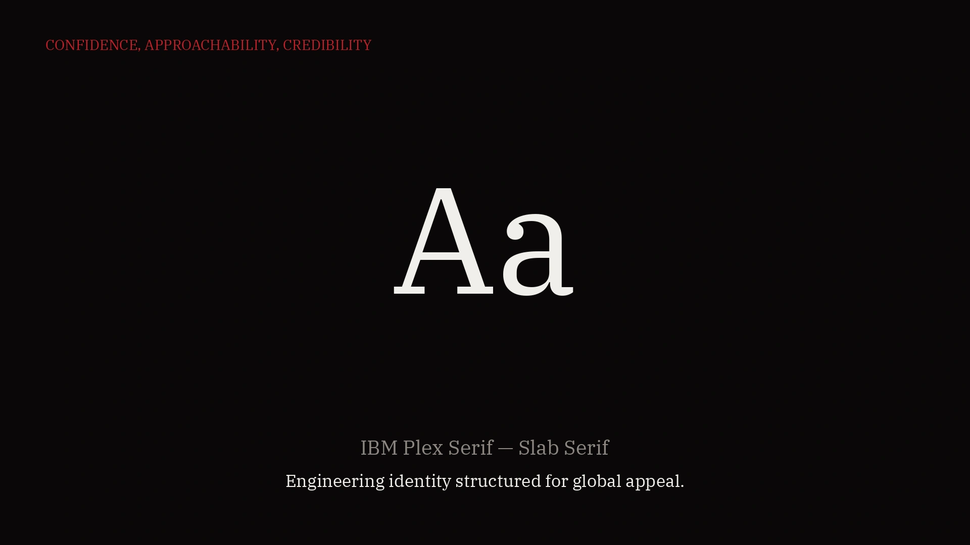
IBM Plex Serif works differently. It carries a uniformity in its curves and widths that philosophically mimics a different kind of voice altogether, confidence, approachability, credibility, without the rigidity. It doesn't sound like an institution talking down to you. It sounds like someone capable talking to you directly.
Here's where it gets interesting. Take the exact same line of copy, "Engineering identity structured for global appeal," and set it in both fonts. The words haven't changed. But the voice behind them has. In Times New Roman, that line reads like a decree. In IBM Plex Serif, the same line reads like a confident statement from someone who's actually done the work.
This is the exact psychology in play every time a brand decides on a typeface. It's not a design decision made for aesthetics. It's a decision about what voice the brand wants to speak in before a single word of actual copy is even read.
So next time you're picking a typeface, don't just ask "does this look nice." Ask what voice it's making your brand speak in, and whether that's actually the voice you want people to hear.