THE TAKEAWAYA brand that sells against luxury still has to look like it is worth the money. The work is earning that with restraint instead of gold leaf.
An identity for a jeweller whose whole position is not being luxury — which meant building something that looks expensive without using luxury's vocabulary.
FACETZ is a fine jewellery brand from Andheri, Mumbai, founded in 2007 by Hrishikesh Railkar. Real 18-karat gold, earth-mined diamonds and precious stones — made light enough to wear on an ordinary Tuesday, and priced at what the metal and the stones are actually worth. It was built out of a specific frustration. A customer looking for real jewellery had two options: heavy, overpriced pieces from the big luxury names, or cheap imitation that would not last. Nothing honest in between. FACETZ was made to be that middle, and after seventeen years of running on word of mouth in Andheri it was going PAN-India and online. I did the identity: strategy, logo, packaging, stationery, pattern, and the direction for how the product is photographed.
The brief had a contradiction in it, and the contradiction was the job. The brand's entire position is *not luxury*. Its own strategy names the competition — CaratLane, Mia, Zoya, BlueStone — and says plainly that it owns the ground between heavy bridal pieces and imitation. Its voice is written to sound like a trusted family jeweller, not a showroom; Hindi and Hinglish friendly, aimed at Tier 2 and Tier 3 India. The words it is forbidden from using are listed: exclusive, opulent, for the few. But a jewellery brand still has to look like it is worth the money. Nobody spends real money with a brand whose box feels cheap. So the identity had to read expensive while being barred from every shortcut that usually buys that look.
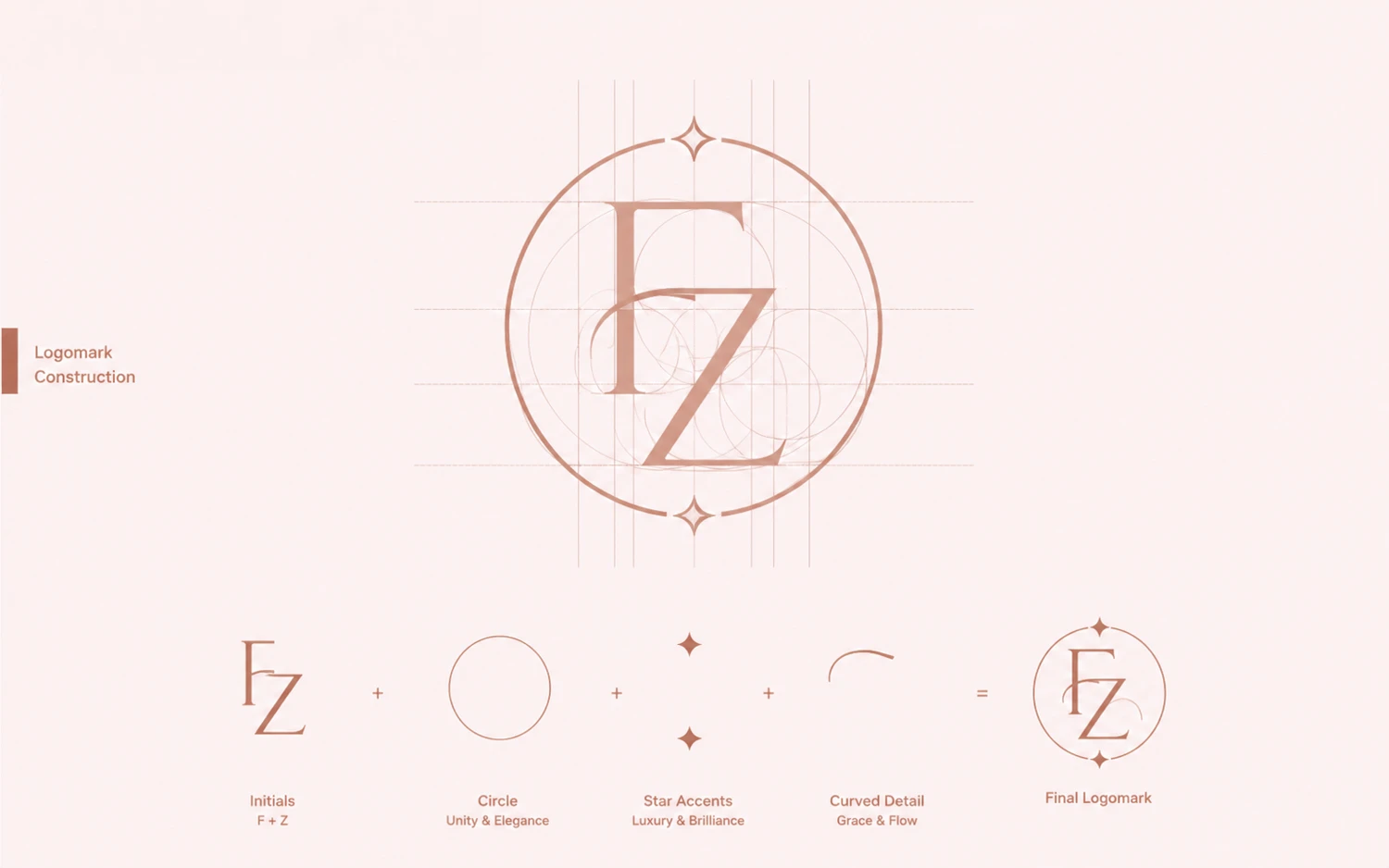
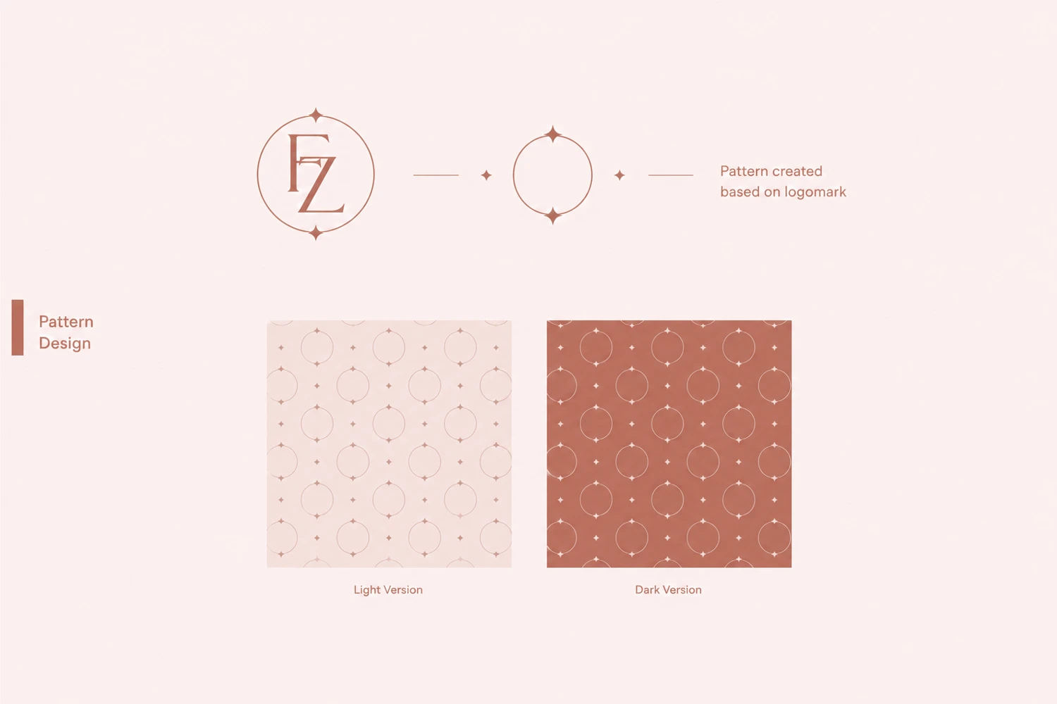
The answer was restraint, and the mark carries it. An F and a Z built on a drawn grid, held inside a circle — a fine hairline weight with no fill, no gradient, no gemstone illustration. It is a monogram, which is the oldest signal of a jeweller's house, executed thin enough that it never shouts. The same construction generates the pattern, so the brand has a surface that can cover a box or a liner without the logo being repeated at full volume. Type is Acme Gothic Wide in Demi and Black — a wide grotesque rather than the high-contrast serif the category defaults to. The serif would have read as luxury, which is the one thing this brand is not.
The palette does the same work. Four Pantones and one accent: a warm off-white, a dusty rose, a terracotta, a deep warm grey — and a single Luxury Gold used sparingly. Terracotta is the decision that matters. The category's reflex is black and gold, and black and gold is exactly how you say "metro luxury markup" without writing it. Warm clay reads as handmade, Indian and honest. It flatters gold in a photograph without competing with it, and it tells the customer, before a word is read, that this is not a showroom trying to intimidate them.
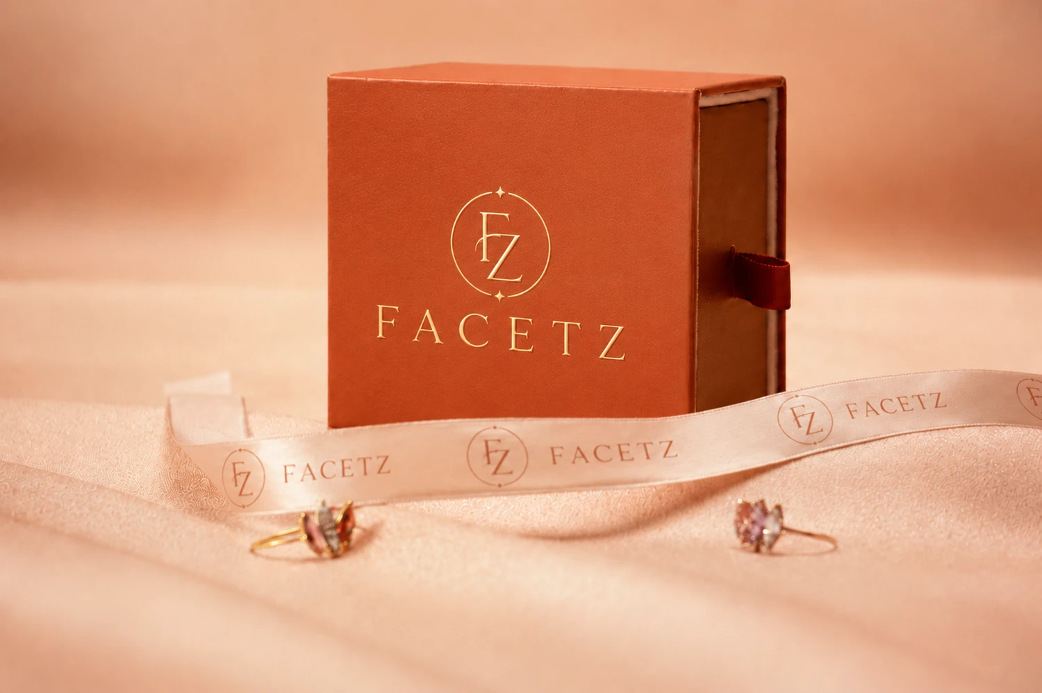
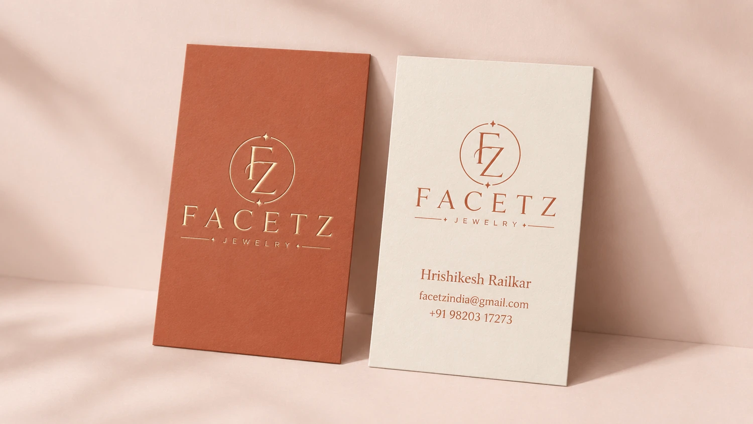
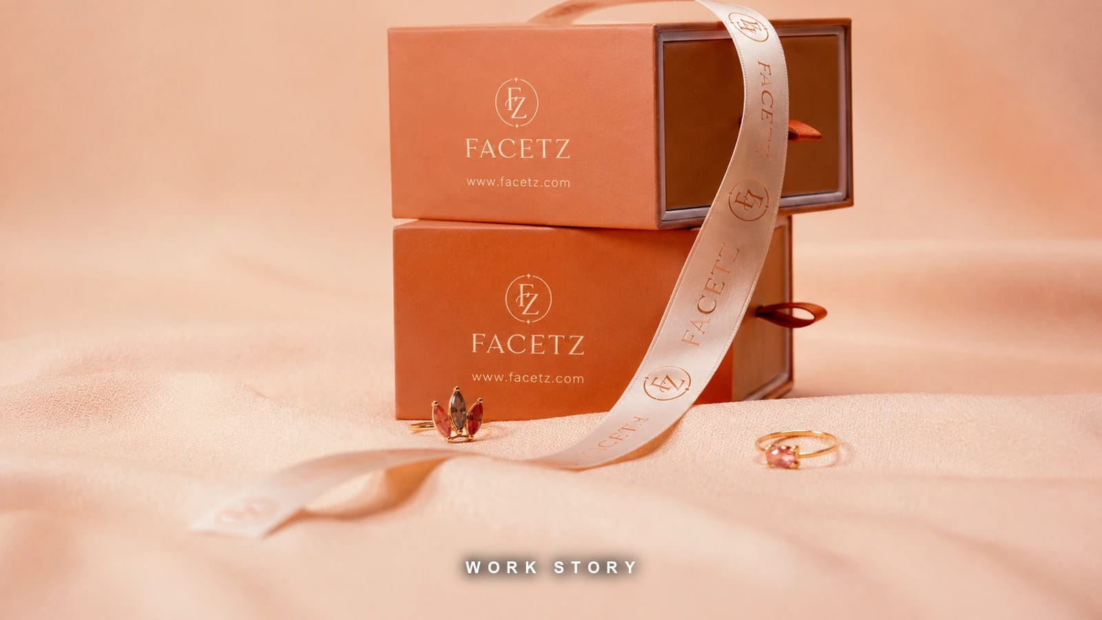
Packaging carried the most weight, because the brand sells online with no shop to walk into. With no storefront, the box is the entire physical experience — the only moment the customer touches the brand instead of looking at it. So the spend goes there: a rigid box rather than a folding carton, a foil monogram, a printed ribbon, a wax seal on the envelope. These are the cues people read as expensive by feel, and they cost a fraction of what a flagship store does. A business that cannot afford a showroom can still afford a box that behaves like one. Stationery, shopping bag and social templates run off the same system, so a customer meets one brand whether it arrives by courier or by Instagram.
The strategy document that sits under all of it is the deliverable I would actually point at: brand story, vision, mission, purpose, voice and tone split by context, the USP written against named competitors, and tagline options with one recommended — "Light on Weight, Honest on Value". That line is the whole brand in six words, and everything above is just the visual argument for it. The full overview is linked below.
The full brand overview — identity, palette, applications and strategy
facetz-branding-bywish.vercel.app NEXT PROJECT ↘FEMBLISS — One Model, a Whole Catalogue